My Controversial Talk on Typography (No Kidding)
If you read this blog regularly, it is no secret that I am a recent convert and evangelist for Matthew Butterick’s Typography for Lawyers. I have a long way to go in my legal writing before I reach a point of mastery, but I am happy to be paying attention. One of the chairs for the Spring Seminar of the Georgia Association of Criminal Defense Lawyers is also an acolyte, and I was invited to speak on typography for an hour. It turns out that I spoke on a little more than typography — subtopics included the need to provide a succinct summary of the desired result, the issues on appeal, and the reasons the court should grant relief, and the need to limit the number of issues on appeal as much as possible. Most cases, after all, are about just one thing.
 I was the next to last speaker on the last day. And, as passionate as I am on the topic, I feared that the topic was a bit nerdy and perhaps boring for some. I hedged my bets by putting some serious work into my presentation and the Keynote slides. Writing materials for a talk on typography is also an intimidating task. The project invites a more critical look than others might. And I put as much planning as I could into making the topic engaging.
It turns out that I was wrong to be afraid. Lawyers, even criminal defense lawyers, are a conservative lot and sometimes not good with suggestions about the need for change. And so it came to pass that I was the only speaker of the entire conference to get heckled. That’s right, in a talk on fonts and the structure of appellate briefs, given on the last day of a three day seminar in Savannah, Georgia, I had a heckler. The guy who spoke on abortion, contraception, and the right to privacy sailed right through without as much as a sigh.
I’ll add that I was thrilled to be heckled on this topic. It is heartwarming that anybody is passionate about typography to such an extent that she told me that an example brief I put on the screen “looked like [shiitake]” because I didn’t turn on full justify and that I was off my rocker for criticizing Times New Roman and Courier. I like passion, even when such passion is misplaced. I am thankful that the reception was so intense, and I also want to take a few lines to say more about these three things — justification (in a graphic design sense not in a theological sense, though I will strive to be graceful), the Courier font, and the Times New Roman font.
Full Justification is a Matter of Personal Preference
The audience member was a serious proponent of full justification, noting by way of simile, that my decision to left-align the text rendered an excrementitious product. The opinion was as wrong as it was hyperbolic. As to the hyperbole: at no point during the presentation did green flies begin to buzz about the screen where my Keynote was being projected. As to the heckler being wrong, I’ll respond here.
Butterick writes (and I defer to him because he wrote the book and because he is credentialed in this area) that “compared to left-aligned text, justification gives text a cleaner, more formal look.” He also notes that justification “alters the ideal spacing of the font, but in paragraphs of reasonable width it’s usually not distracting.”
In the end, he notes that “[j]ustification is a matter of personal preference. It is not a signifier of professional typography.” He cites as an example the fact that many newspapers mix it up.
I will add that I never endorsed either way. I just used a previous brief of mine, one where the text was left-aligned, as an example. The audience member has a strong preference for justification. She’s not wrong to have it but was wrong in the extent of her criticism of left alignment.
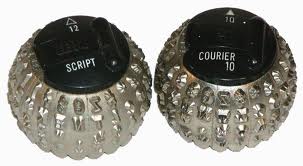
A Defense of Courier, Really?
I took some heat for my criticism of Courier. And I was actually quite surprised that anybody but a prosecutor or bureaucrat would feel so strongly about this font. This font served its purpose in 1955 when it was invented. The font was created for the “golfball” typing head that IBM was developing and would later premier in its 1961 Selectric Typewriter. The font, and other monospaced fonts, was created to deal with mechanical issues with the typewriter. To quote Mr. Butterick, “[monospaced fonts] were not invented to win beauty contests.”
To quote an article from Slate, “its design principles are little more than phantom limbs: Like any other typeface, it is whisked from the digital ether without regard for its original use. … What is most remarkable of all, of course, is that a typewriter font is still being used at all in the post-typewriter age.”
With the exception of Robert Caro, I do not know of anybody who still uses a typewriter. So, it really isn’t necessary to use a monospaced font.
When you use monospaced fonts, you get fewer words per page, and the font is hard to read when compared to proportional fonts. There really is no reason to use Courier unless a court rule requires it.
In 2004, Courier fell out of favor with the State Department. The preferred font is now Times New Roman 14.
It’s Time for the Decline and Fall of the (Times New) Roman Empire
The heckler also has a special place in her heart for TNR. It’s an okay font. Though its problem is its ubiquity. Using TNR is essentially not choosing a font at all. According to Mr. Butterick, the problem is the blah factor:
When Times New Roman appears in a book, a document, or advertisement, it connotes apathy. It says, “I submitted to the font of least resistance.” Times New Roman is not a font choice so much as the absence of a font choice, like the blackness of deep space is not a color. To look at Times New Roman is to gaze into the void.”
Finally, he advises, “if you have a choice about using Times New Roman, please stop. Use something else.” A person can choose Times New Roman and be passionate about it (I know one person who does and is). But that choice conveys apathy.
A Final Word
If you are in the Georgia Supreme Court or the Georgia Court of Appeals, you have little choice about your font selection. You can go with Courier New 12 and look like a prosecutor, or you can go with Times New Roman 14. At either of those courts, TNR conveys that you don’t want your appeal dismissed and that you don’t want to be sanctioned. It does not convey apathy. In client letters and in filings in other courts, you can and should (in the name of all that is holy) choose other fonts.
Leave a Reply
Want to join the discussion?Feel free to contribute!